
The Beige-ification of Hotels
I’ve worked in the hotel industry for over 20 years, from launching my family’s boutique hotel in Umbria into the pages of Condé Nast Traveller to consulting on social media strategy for The Langham Hotels. Over that time, I’ve watched how interiors tell the story of a property, and how easily that story can be flattened. Beige-ification in hotels is a symptom of two things: globalisation and risk aversion. When brands expand internationally, they often prioritise consistency over character. Beige, taupe and cream palettes feel safe – they photograph well, appeal to a wide audience, and avoid polarising design choices.
The cost of this caution is that hotels risk stripping away the very sense of place that travellers crave. A beige bedroom in Hong Kong feels identical to one in New York or Paris. You could be anywhere. Guests increasingly tell me they want authenticity – whether that’s local art on the walls, regional materials in the bathrooms, or colour palettes inspired by the destination. Beige may soothe, but it rarely inspires.
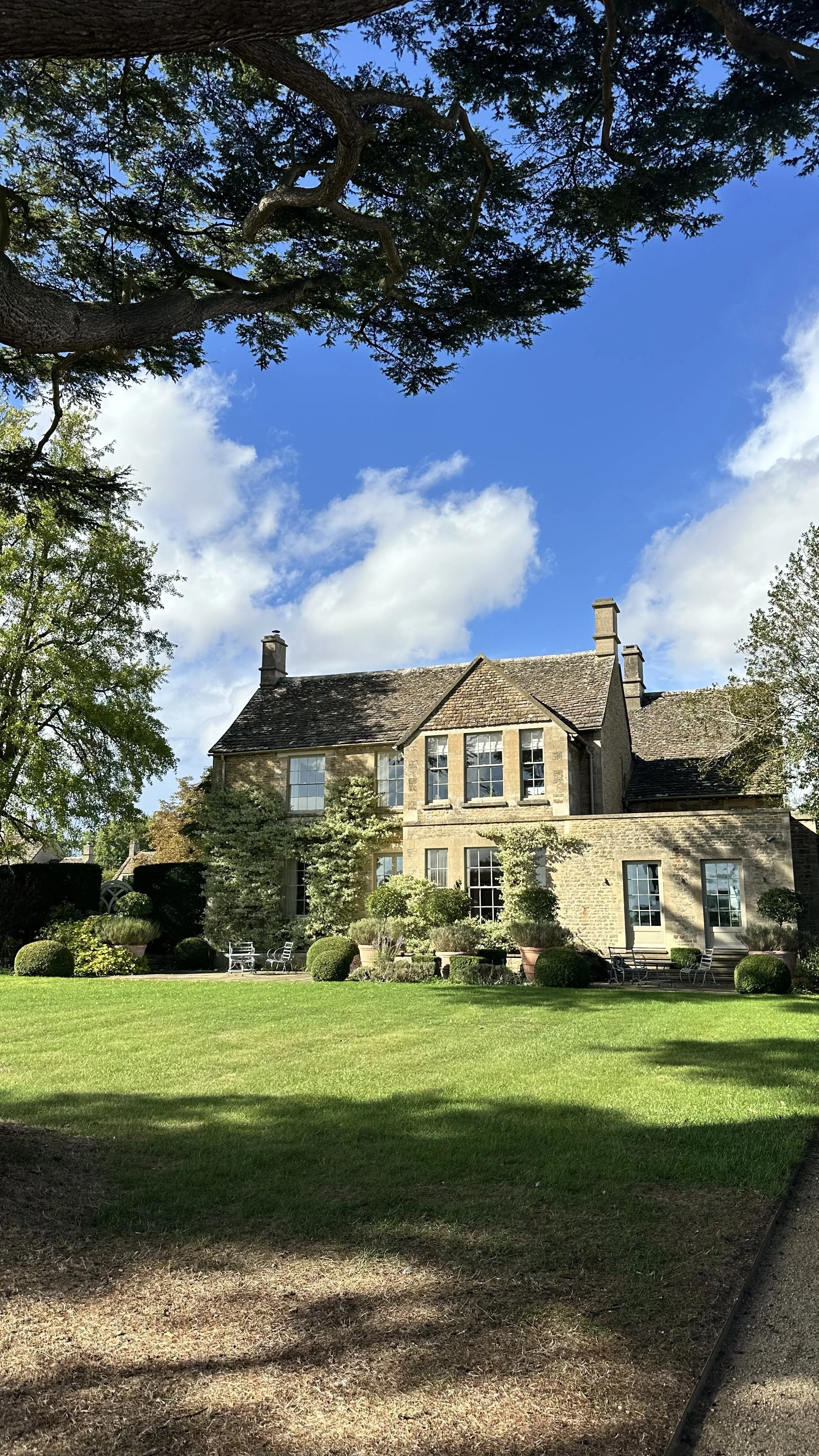
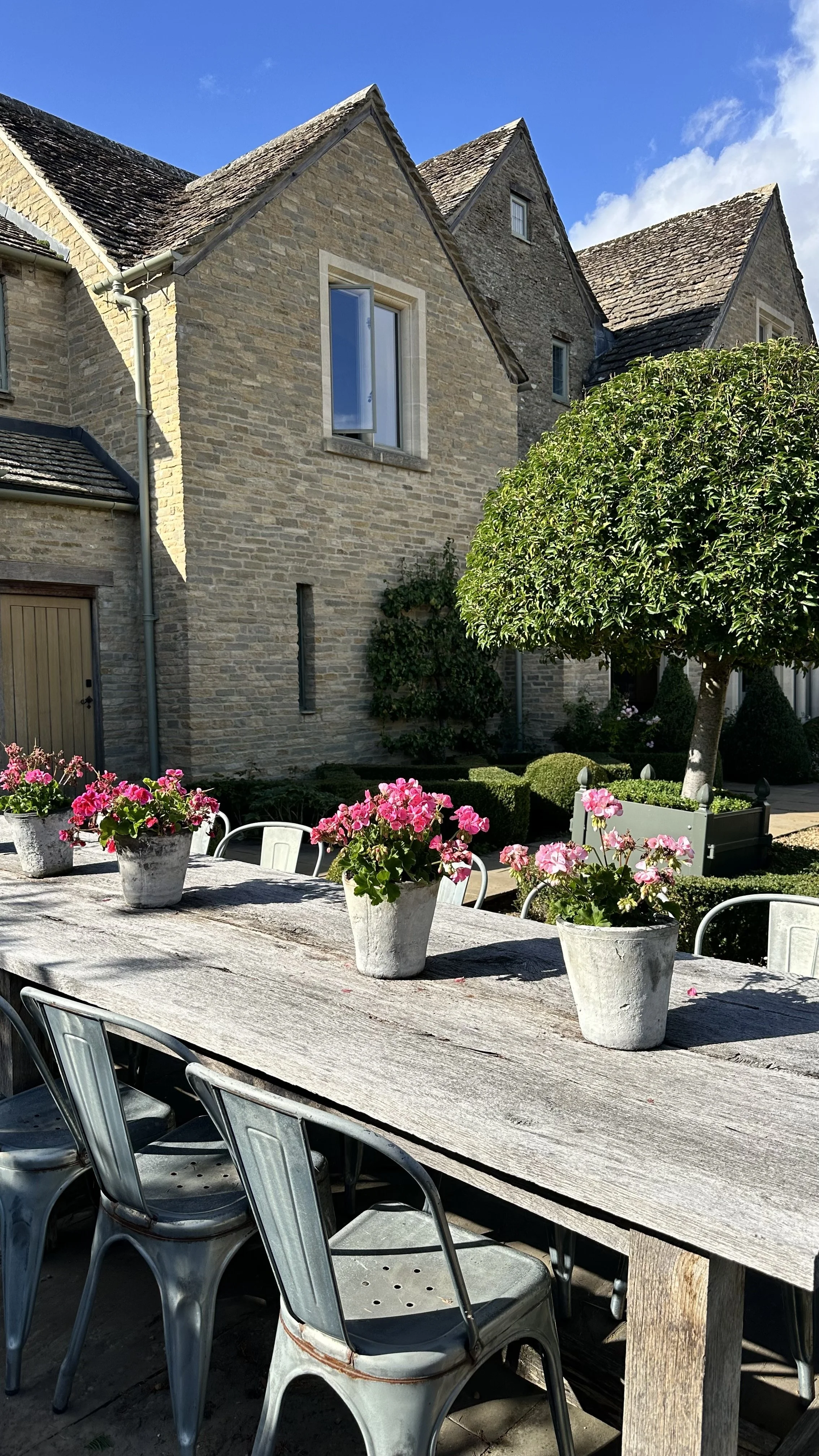
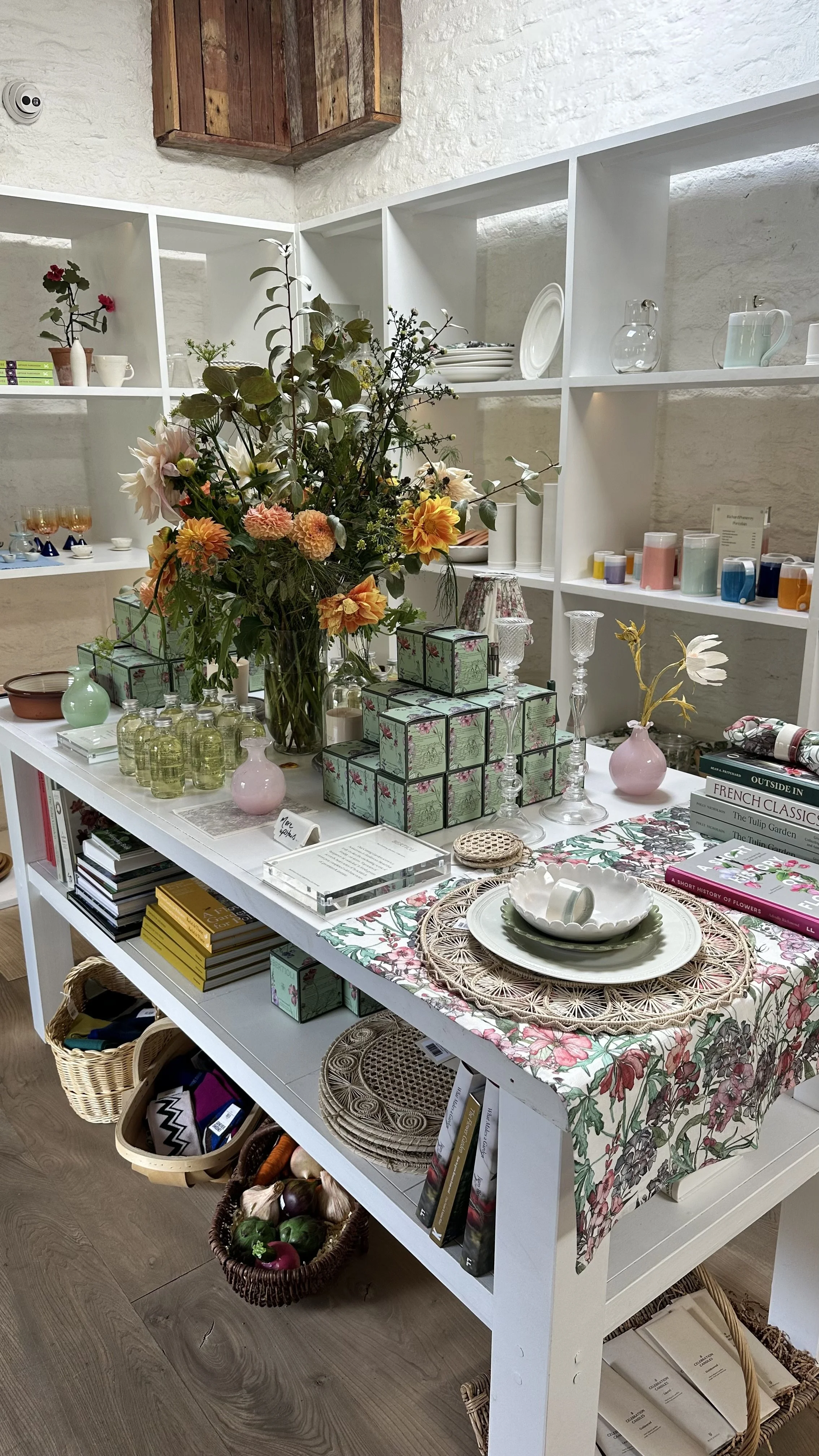
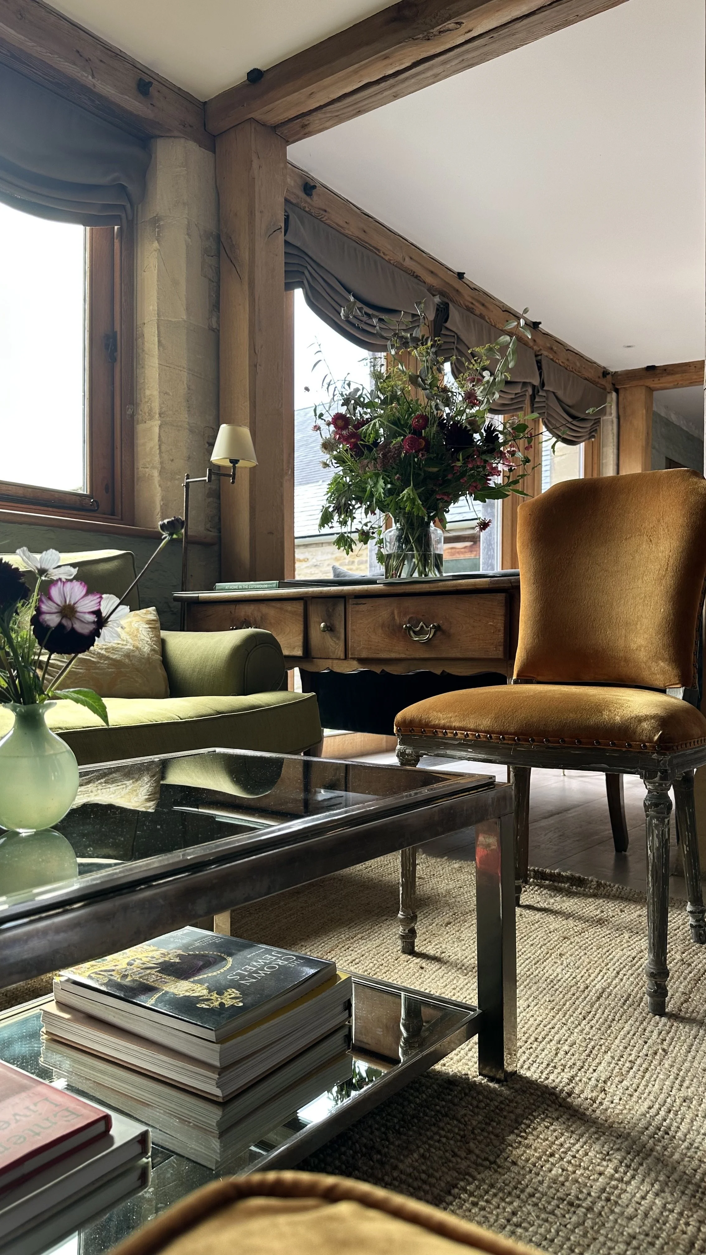
The hotels that stand out are those resisting uniformity and they tend to be independently owned and run. Privately owned and family-run Thyme Hotel in the Cotswolds is a perfect example: walls painted in Edward Bulmer’s natural shades, with soft pink bathrooms, floral fabrics designed in-house, rich velvets in the Baa Bar, and the Meadow Spa washed in calming greens that echo the surrounding fields. Every choice by the family-led team reflects the location and creates a memory guests carry home.

Similarly, Kit Kemp’s Firmdale Hotels in London and New York are celebrated for their fearless use of pattern and colour, where each room feels like a one-off. At Hotel Tresanton in Cornwall, Olga Polizzi’s crisp blues and whites mirror the sea outside, while in Paris, Hôtel des Grands Boulevards layers jewel-tones and antiques in a way that anchors you in the city’s history.

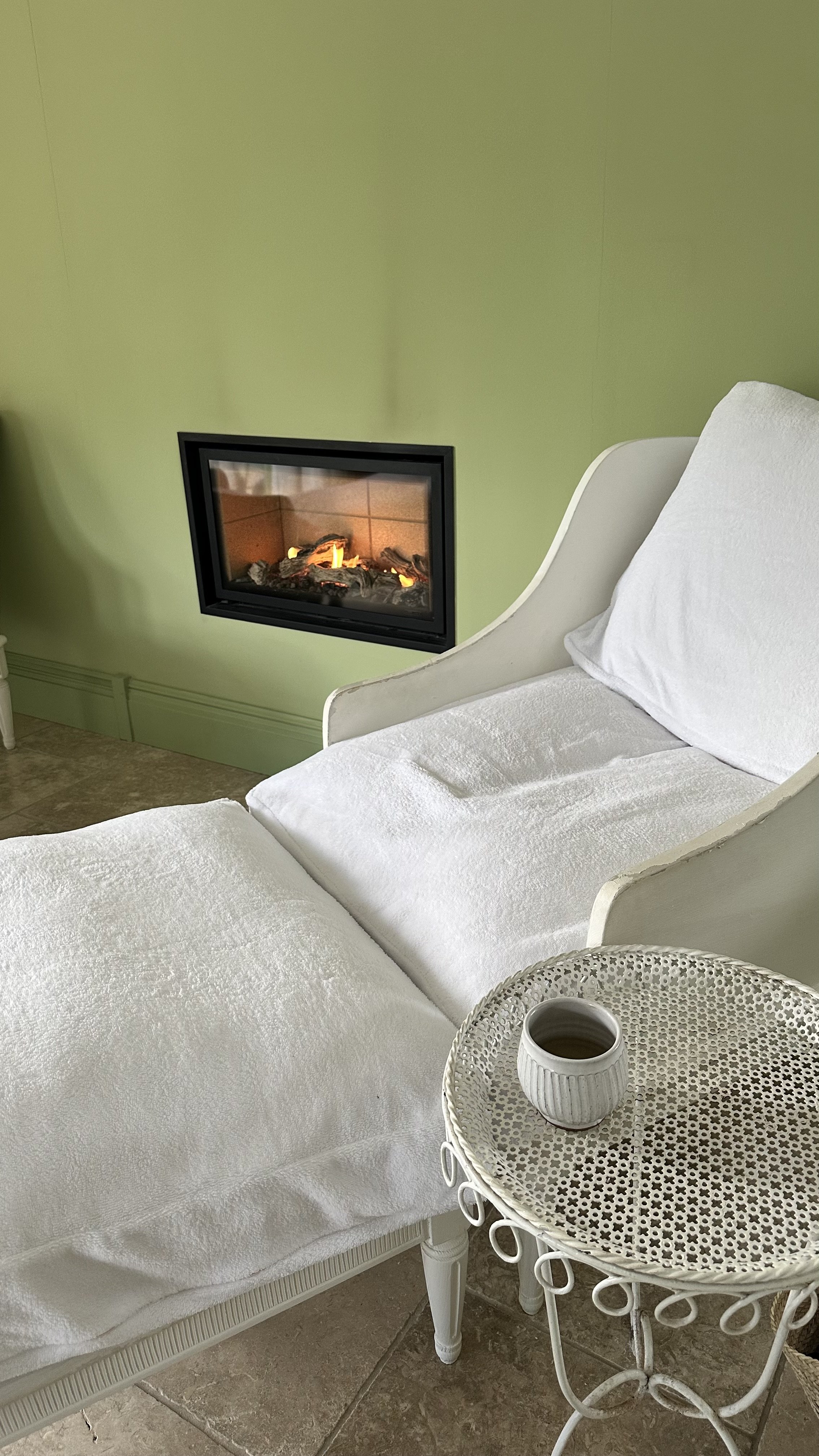
Spa at Ockenden Manor
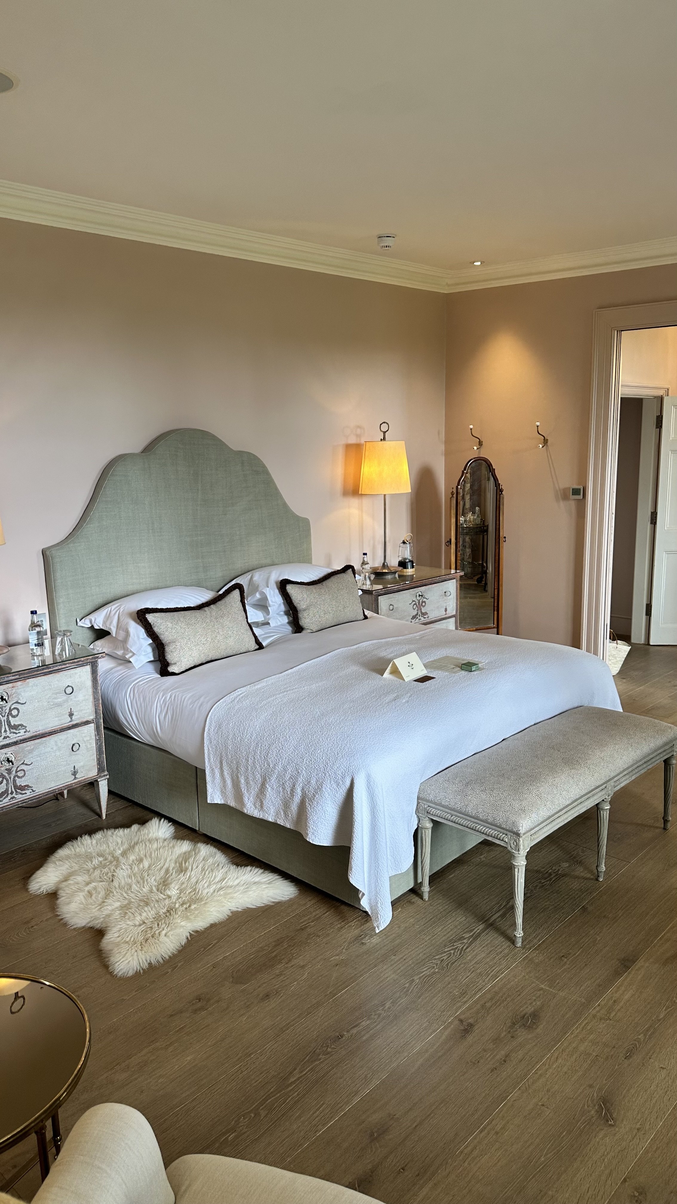
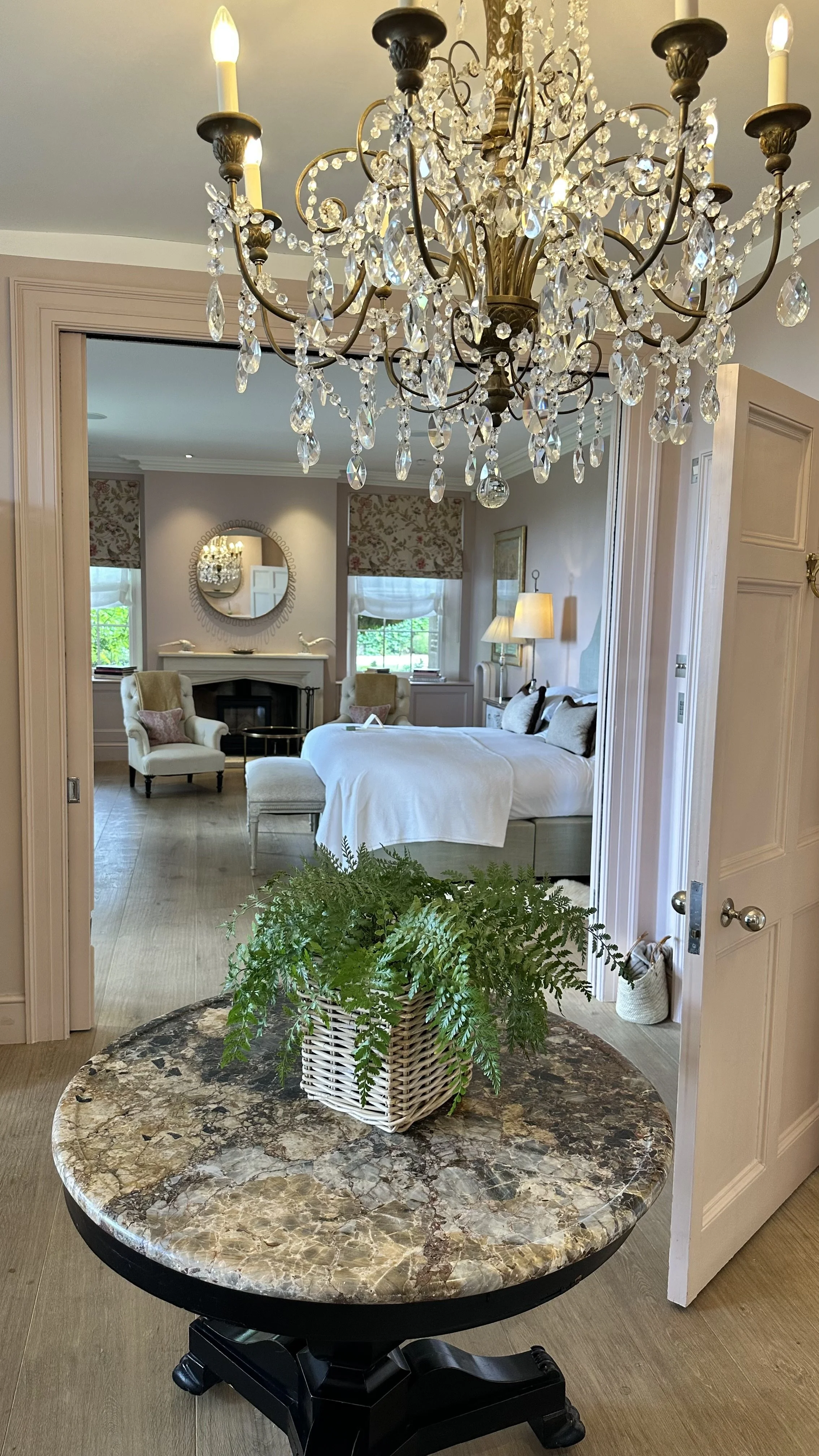
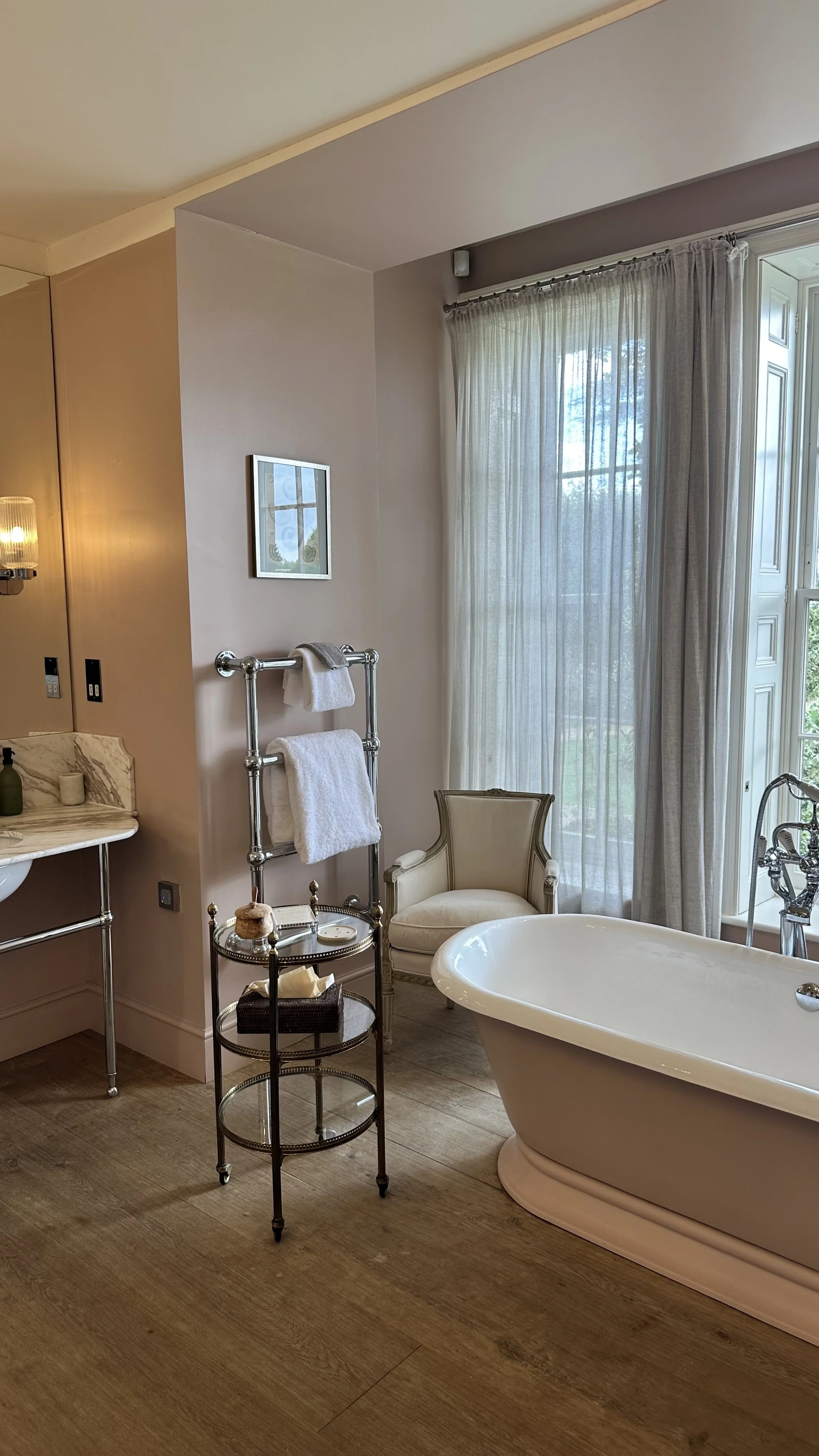
Closer to home, Ockenden Manor in West Sussex shows how colour can be both rooted in history and forward-thinking. In the main house, centuries-old oak panelling is balanced by warm, heritage tones, while the spa wing brings in fresh greens, blues and light-filled spaces that draw directly from the gardens and surrounding countryside. The use of colour here gives a sense of narrative – the manor’s past intertwined with a contemporary vision of wellness. The hotel is also filled with beautiful fresh flowers that are changed regularly, filling the space with colour.

Ockenden Manor, Historic Sussex Hotels
These hotels prove that colour is not a risk but a signature.
Beige is the easy option, but in the long term, it dilutes a hotel’s identity and makes it forgettable in a crowded market. Bold interiors, thoughtful storytelling and design choices rooted in place are what keep hotels alive in the imagination – and what will keep travellers returning.